What’s a poor, freshly minted developer to do when they’re out of coding boot camp but don’t have any real-life experience? You step into the world of simulation. That’s the basic premise of what Wilco offers. Last week, I covered the company’s $7 million seed funding round, and the company’s CEO, On Freund, was gracious enough to let me use the deck the company created to close that round for my Pitch Deck Teardown series.
One of the things I love, love, love about the deck is that it — like the company’s overall design style — uses the Sierra-era games look. Specifically, it harkens back to the old 1980s and ’90s Space Quest games, and the company itself, Wilco, is apparently named after Space Quest’s main protagonist, Roger Wilco.
TechCrunch+ is having an Independence Day sale! Save 50% on an annual subscription here.
(More on TechCrunch+ here if you need it!)
It’s a particularly fitting name, given that Roger, in the Space Quest series, is a hapless but well-meaning “sanitation engineer” (i.e., janitor) who, more or less by accident, ends up rescuing the world time and time again. If you want to truly deep rabbit-hole into retro-tasticness, check out the excellent Space Quest Historian podcast. Because of course there is a podcast about the history of Space Quest.
Aaaanyway — sorry, my 8-bit nerd is showing, and nostalgia does occasionally get the better of me. Where were we? Oh, yeah, pitch decks and the tearing down thereof.
I’m always on the lookout for more pitch decks we can share with our TechCrunch readers.
We even put together a submission process of sorts. Here’s some more info about how to get involved.
Slides in this deck
Wilco’s seed deck is a 19-slide deck that ticks all of the boxes. The ink on the investment round article isn’t even dry yet, so the unredacted deck would be full of a lot of business-sensitive information; the Wilco team pointed out that it has made a few redactions for them to be comfortable sharing the deck. I’ve noted them in the list of slides below.
- Cover slide
- Team slide
- Problem slide
- “What’s happening today?” — Problem context slide
- Mission slide
- “Who are we” — Value proposition slide
- Solution slide
- “Wilco’s solution is customizable & adapts and connects to common tools” — Product slide
- “Scale vs. Customization” — Beachhead go-to-market slide
- “The Wilco Effect” — Product benefits slide
- “Product Experience” — Product screenshot (and demo, possibly?)
- Go-to-market slide
- Traction slide — Redacted: Monthly active users (graph of users over time)
- Traction slide — Redacted: Customer logos removed
- Traction slide — Redacted: Content partner/customer logos removed
- “What customers are saying about us” — Testimonial slide
- Competition slide
- The Ask slide — Redacted: Some numbers removed
- “Let’s talk!” — Contact info slide
Three things to love
I’ve already gushed about Wilco’s talent for graphics, but it seems as if the company’s talent goes deeper than that. The deck utilizes great storytelling craftsmanship. Here are a few highlights:
Benefits over features

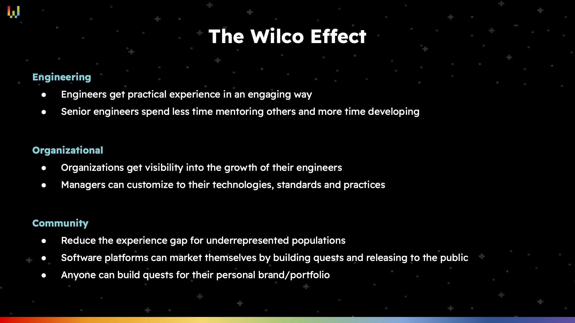
[Slide 10] By breaking down the benefits to each user, Wilco explains its raison d’être. Image Credits: Wilco
On Slide 10, Wilco does an incredible job of just this; they call it “the Wilco effect,” but realistically, it’s benefits. Junior engineers get practical experience, senior engineers get more time back, management gets visibility into its human resource development and better control over training, and the broader community benefits in a number of ways.
The “how” will be important but risks the temptation of getting into more detail than what’s important for a pitch deck. The “what” is too tactical; for this part of the story, it doesn’t really matter what users need to do to gain these benefits. Focusing on the “why” is why this slide is so powerful; it opens the door to more in-depth conversations if needed, but the groundwork is there. I wish more startups got this right!
A beautifully crisp ask

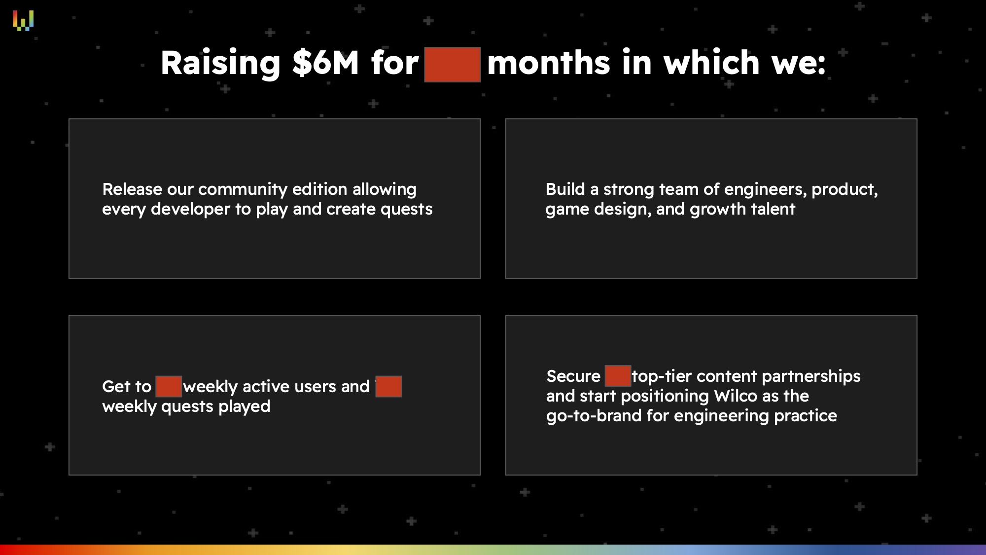
[Slide 18] The redactions remove the specifics, but the story is solid. Image Credits: Wilco (opens in a new window)
That’s the promise the company is making to its investors: Give us $6 million, and we’ll get it done.
In the first box, the company talks about releasing a “community edition” that enables (not “allows,” but I probably care more about that than I should) developers to play and create quests. It isn’t specified anywhere in the deck what the feature set is here, so I’d expect there to be an appendix slide that shows a product road map of sorts. Nonetheless, it’s a clear goal.
In the second box, the company outlines its hiring plan. Of course, “strong team” is a little fuzzy; I’d have loved to see some numbers here, but it works.
In the third box, Wilco gets things ever so very right. “Get to X WAUs and Y weekly quests played” is a super clear SMART goal: It is specific and measurable; there’s no doubt whether the goal has been hit or not. The numbers are covered, so I have no way of knowing whether it’s achievable, but that’s the promise the company is making to its investors: Give us $6 million, and we’ll get it done. It’s relevant: Hitting that goal will unlock the next round of funding. And it’s time-bound, presumably “in the next 18 months” — more about that in just a moment. Brilliant. Bold. Yes. More of this — specific, clear, believable goals for what you’re going to achieve with your investments will go a long way toward securing faith in how your company is going to do between this fundraising round and the next.
In the fourth box, the company is setting some specific goals around its growth trajectory, with a number of partnerships it needs to land in order to facilitate future growth, expressed as a SMART goal.
I have one minor point that I’d love to have seen done differently here. I don’t know how many months of runway the company is raising for here, but I’d be willing to bet money that the red box covers the number 18. Why? Well, that’s pretty much the standard for a fundraise these days: You raise for 18 months and restart fundraising when there are six months of runway left.
Much less than 18 months and you don’t have enough time to get meaningful work done. Much more than that and you’re attempting clairvoyance into a timeline that is a little unrealistic. Besides, a lot of startups aim for 18 months, but then go hell for leather to try to hit the milestones earlier.
In a nutshell, you don’t raise money because you are running out of money as planned. You raise money because you’ve successfully delivered on the milestones and you need more money to go after your next set of milestones. In short: Don’t worry about putting the amount of time on your slide deck anywhere; it isn’t helpful, and it’ll show up as part of your operating plan and financial plans anyway.
Clearly framed problem
I usually just share one slide here, but slides three and four go together, so here’s a twofer for you:

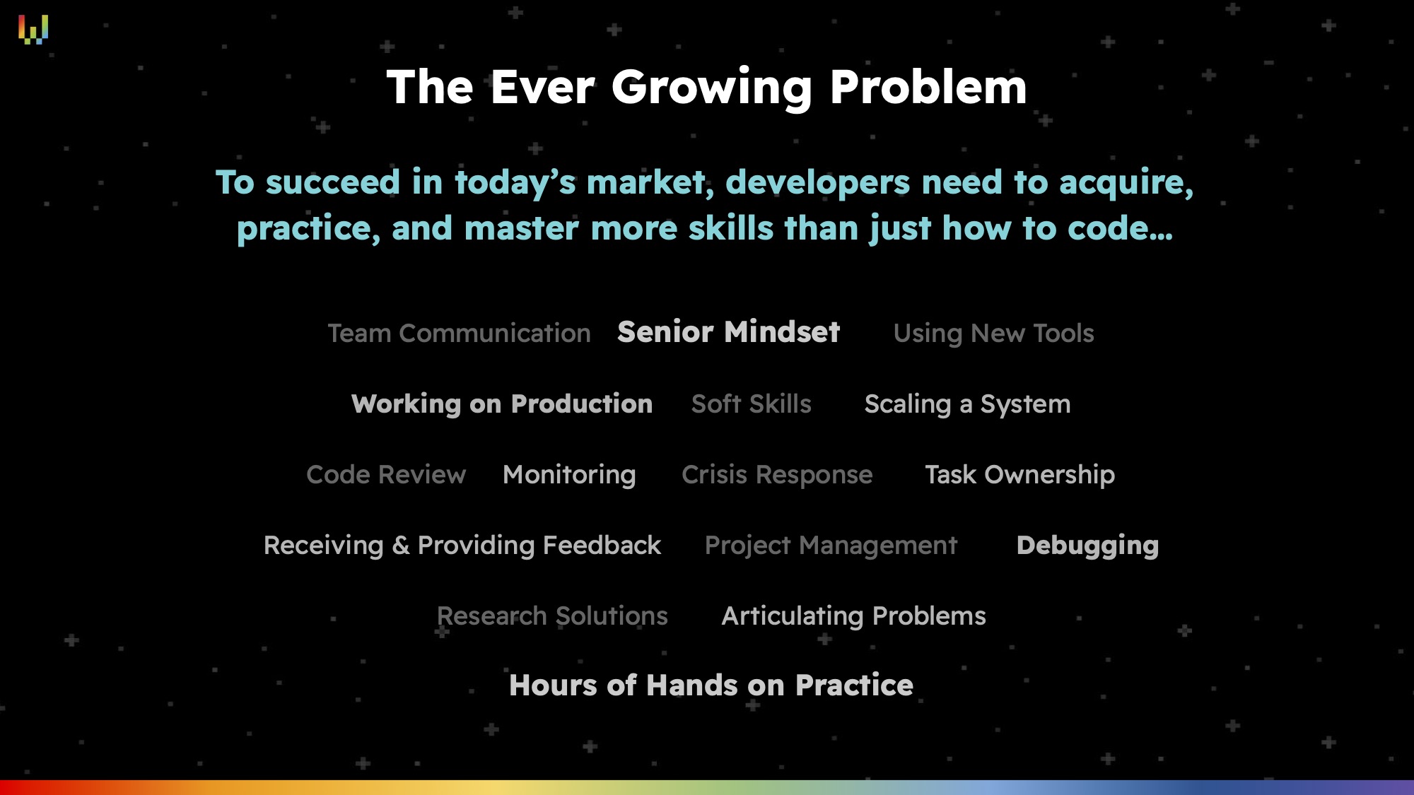
[Slide 3] Problem proposition. Image Credits: Wilco (opens in a new window)

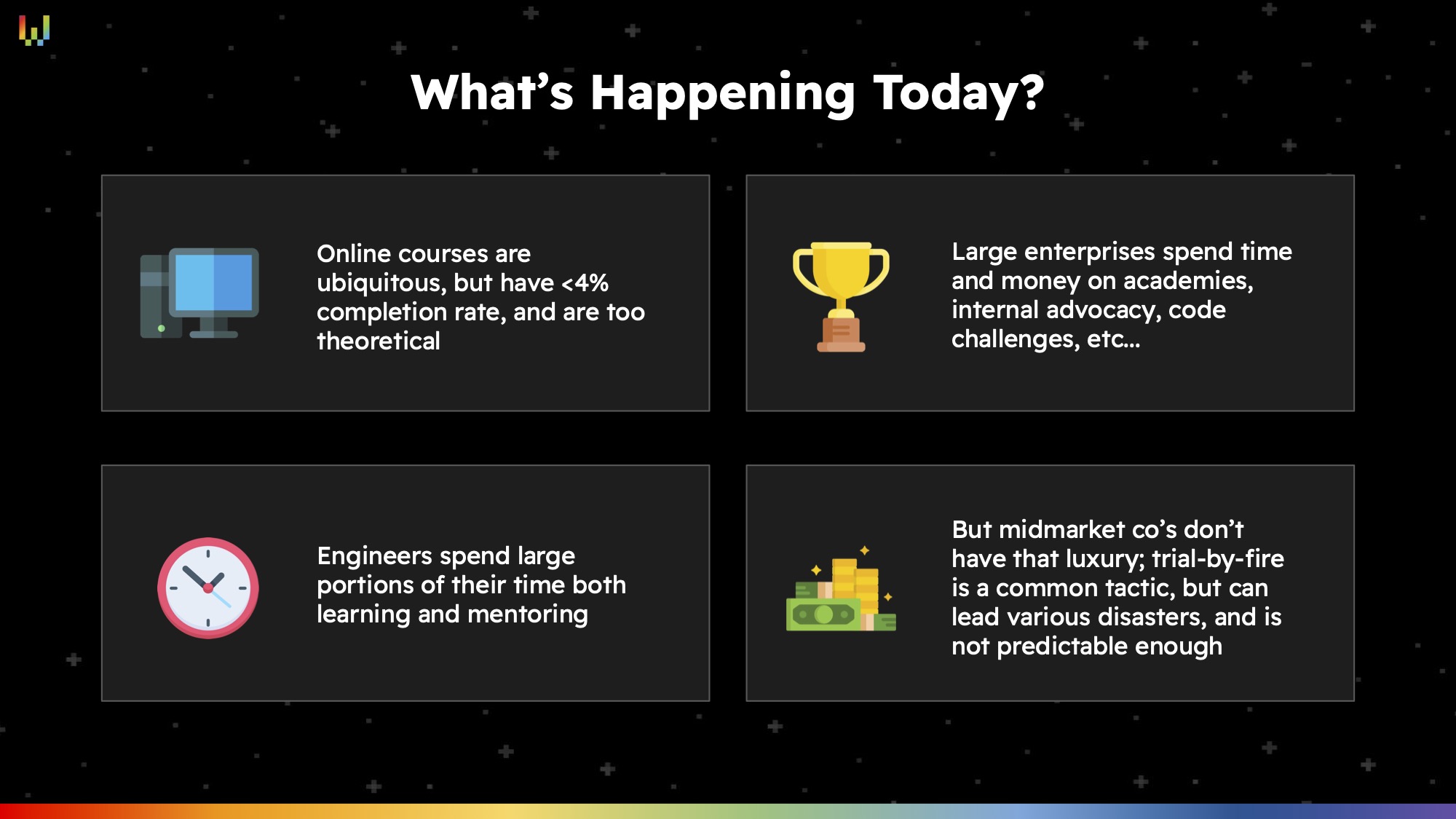
[Slide 4] How companies solve it today. Image Credits: Wilco (opens in a new window)
Even for someone who isn’t intimately familiar with the ins and outs of running a development-forward organization, Wilco’s value proposition is clear and easy to understand. Super impressive, given how many ways the company could have gotten this horribly wrong.
In the rest of this teardown, we’ll take a look at three things Wilco could have improved or done differently, along with its full pitch deck!
from TechCrunch https://ift.tt/V1jBK7y

Comments
Post a Comment